So when I first graduated from college, the plan was always to go and work for the United Nations. That was kind of what I had my heart set on, and I was creating data visualizations about refugee movements.
And I really quickly became quite concerned and frustrated because the refugees who were being represented in these pie charts and bar charts, never got a chance to see those data visualizations. So the people who were being represented didn’t get a chance to be like, “Wait a second, I don’t think that’s right.”
There was this one really pivotal moment where we had a conference and were creating these data visualizations about migration. And one of the people who was actually going out and asking people, “What is it that you need?” in order for me to be back at the office cranking out these pie charts, said to me, “You know, it’s all wrong.” And he said that he was going out with these questionnaires and asking people, “Do you need food? Do you need blankets? Do you need water?” And actually what they needed was electricity generators, but it wasn’t one of the options on the form.
So we’re creating these beautiful pie charts that say “12% of people need blankets,” but it’s completely meaningless.
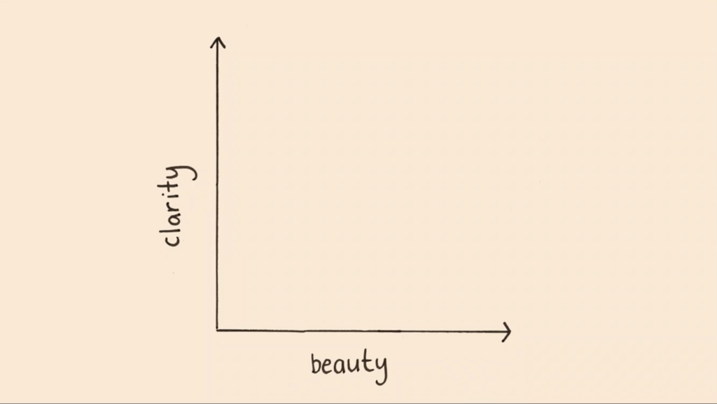
So when I’m thinking about data visualizations, you can kind of think of them on two different spectrums, right? You can gauge them based on their clarity and based on their beauty.
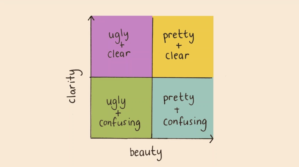
If you use this classification system, there’s four types of charts, right? There are charts that are both ugly and confusing. There are charts that are pretty, but confusing. Charts that are ugly but clear, which is preferable to a chart that is pretty and confusing—confusing is the worst thing you can possibly do.
And lastly, you can create charts that are both pretty and clear. And that is what I’m constantly aspiring towards in my work.
So, I want to share with you the most recent public art piece I completed and walk you through exactly how it was created.
The Brooklyn Museum got in touch with me and they were working with the World Health Organization and wanted to create a piece of public art around Covid. Now, I don’t know how everyone else’s levels of depression were doing, but I was feeling pretty low and like I didn’t really want to communicate how severe it was… but I also couldn’t handle any more negative imagery in front of me.
And so what I started to look into were some of the factors that can reduce the spread of Covid.
And I found this incredible body of research—multiple studies that found that the existence of trees reduces the spread of Covid. And this is even when you control for other factors like rural versus urban population density, all of these things.
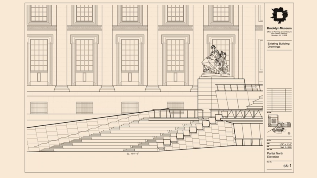
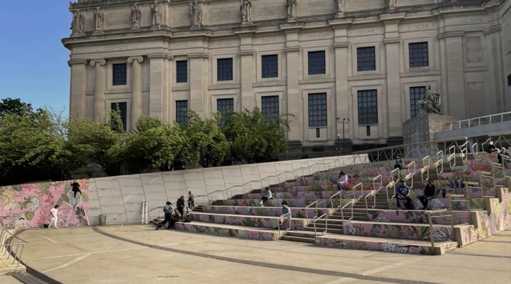
And so I kind of wanted to create an ode to New York’s trees. So this was the space that I knew that I was gonna have to work with. It was the steps of the museum itself, which was really exciting.
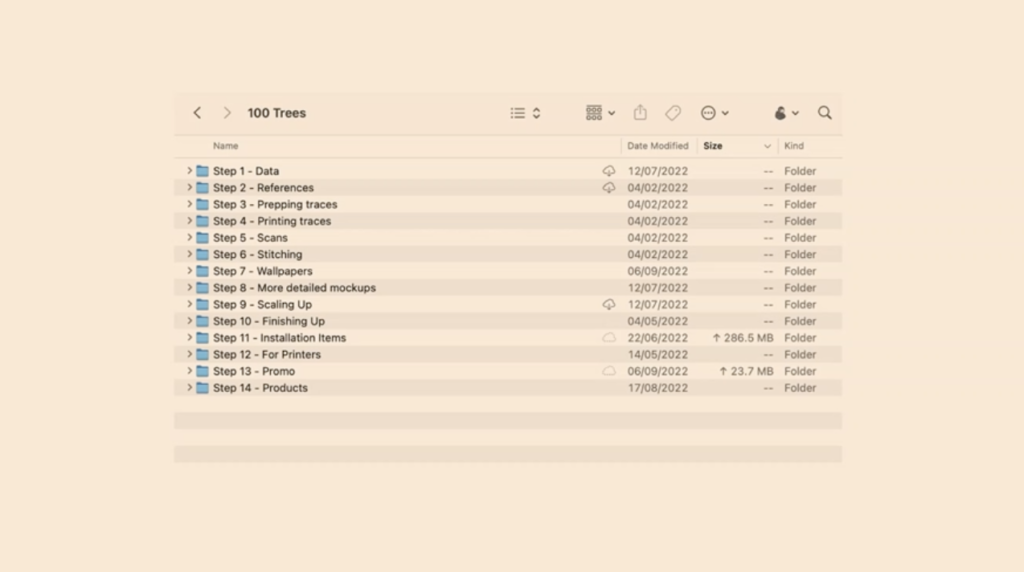
I started off by actually finding the data, which again, is often like I haven’t talked that much about that today because it can be quite mind numbing, but it’s also vastly, vastly important to make sure that I’m finding the right data.
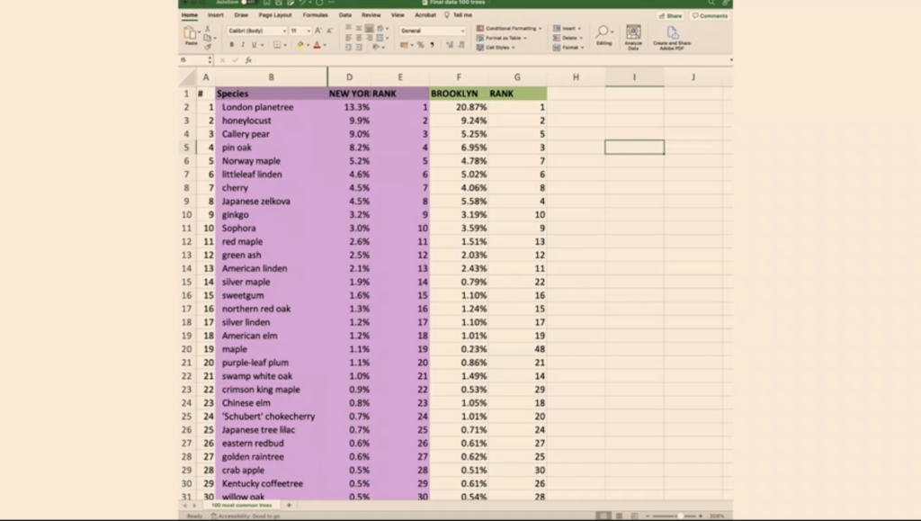
So this comes from the New York City Parks Department. It’s incredible. Every 10 years they send volunteers out with clipboards who count every single tree in the city and they log the health, the condition of the trees, and the name of the trees. So we have this incredible data set of every tree in New York.
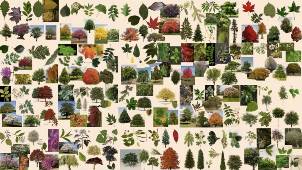
And based on this data, I analyzed just the top 100 most common trees. And I found visual photos online of each of those 100 trees, as well as the leaves that come from those trees so that people would be able to identify the trees from their leaves.
And then I spent a really long time drawing them all. I created the ink separate from the color because I wasn’t sure whether I wanted to do both or just one part of it. Then I scanned all of them together.
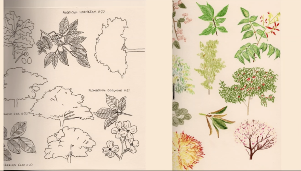
I wanted to do it this way because I’m so fascinated by process. I wanted people to be able to see every single line of the color.
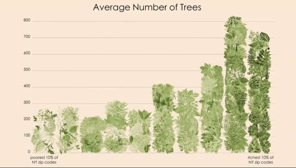
I also wanted to talk about inequality because that’s what I’m always talking about, right?
So this is the average number of trees in the poorest New York zip codes versus the richest zip codes. So I still wanted to make this point that even though the color green can minimize Covid rates, not everyone gets equal access to the color green and to trees.
And this was the final result. This was a process that took a very, very, very long time.
So it’s finding data, finding those visual references, scanning everything, stitching it together.
And the thing that’s really, really exciting about this piece of work—people have told me that based on the work, they were able to pick up the phone and call their representative and say, “We want more trees where we live.”
———
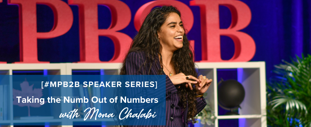
You can watch Mona Chalabi’s Keynote presentation from the fall 2022 B2B Forum below:
Mona Chalabi’s Keynote Presentation from the Fall 2022 B2B Forum, “Taking the Numb Out of Numbers”
Post published on 2/26/23
B2B Forum is packed with marketing insights, strategies, and tactics taken from the real world experience of over fifty industry experts, packaged into context you can actually put to use.
Join us in Boston for B2B Forum this coming November 17-19, 2025. Early buyers get B2B Forum tickets at their lowest rate, and discounted hotel rooms are available while they last.